Hero Section Title

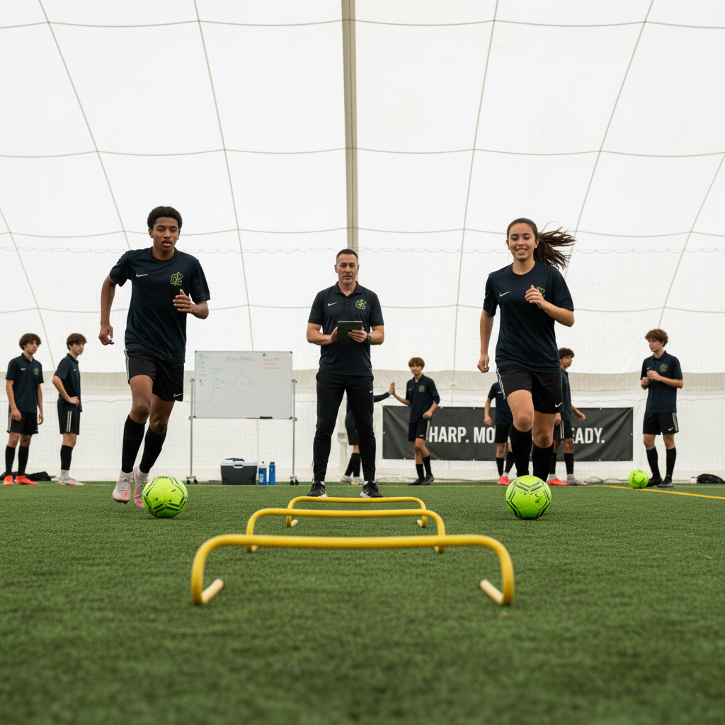
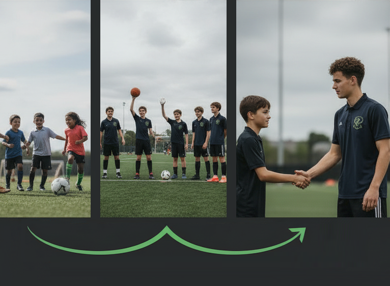
Hero sections have this supporting statement, should only be a few sentences. Section always has a call to action, typically rendered as a button. And between zero and five objection rebuttals, typically rendered as a bullet list. On desktop image should be on the right, on mobile image should be at the top.

Get Started Now

The Text Section

The simplest type of section is the Text Section (<section class='text'>). This allows for a block of HTML to be embedded with an inline flow. It is not typically used with complex pages like home pages that need their own styling. It is great for supporting pages, like Terms of Service and Privacy Policy that just need a single "wall-of-text" page of content.

What it supports?

Well, basic HTML formatting limited to safe tags that users can edit but none of the advanced layout. Basically semantic content tags such as:

  • Bullets and numbered lists
  • Character markup, bold, italic, bold and italic, strikethrough, and monospace/code.
  • Hyperlink follow CommonMark Specification

Header 4

Header 5
Header 6

Alert Section

An Alert Section contains time-constrained information to be displayed on the website.

The alert section (above) has three type sub-types which are reflected in the class names and image sources. These are:

  • Broadcast Used for neutral content such as "Registrations Open"
  • Warning Used for adverse events, such as "Fields Closed Due to Weather".
  • Announcement Used for positive events, such as "Celebrate QPL Victory!"

The names of the sub-type are included in the section class name, e.g. <section class='alert broadcast'>.

Images are also part of the alert and are automatically assigned based on the Alert Type. Examples of these follow in the next two alerts. The mapping is as follows:

  • Broadcast => alert-info.svg
  • Warning => alert-warning.svg
  • Announcement => alert-success.svg

Alerts also have an optional Call to Action button. The alert above does not have a call to action, but the examples below do.

Fields Closed

Due to the cyclone, the fields are under 30cm of water and can't be used.

Go Broncos!

Let's all celebrate the amazing QPL win of the Broncos with an end-of-year Fete!

This is a Feature Section (<section class='feature'>). This is designed to provide text and an image with context about the feature. These are commonly used to highlight the core features of the company, a product, or a service.

These Feature Sections often come one after another in a list. On desktop styling might choose to alternate the image placement to maintain interested in these longer lists of data. This is done with additional classes:

  • section-odd and section-even will alternate for all sections on the entire page.
  • sequence-odd and sequence-even will alternate for sections of the same type that occur right after each other. The default template uses this to swap background color of features on all platforms. On desktop, it also swaps the image alignment from left to right.

Another short feature section.

Spotlight Section

A spotlight is a section that is typically shorter than a Text section, used for dividing pages logically, maybe with a callout or a testimonial. Default formatting has extreme margins for desktop and center aligned headers.

A video section is designed to host YouTube embedded media, with optional summary or descriptive text section.

Frequently Asked Questions

What is a FAQ Section?

A FAQ is the Frequently Asked Questions section which has a number of common questions and their answers.

How many Questions?

Section will typically have between five and nine (the magical number seven, plus or minus two). Too few negates the layout, too many is confusing for users.

How to format?

This section is one of the few where it makes sense to hide interface. Typically show all the questions and reveal the answer on tap/click.

Desktop versus mobile differences?

Yes, this can be quite different, or might just be related to the location of a supporting image with respect to the questions and answers.

How long are questions and answers?

It's safe to assume that the questions will be short and concise and designing for 50 characters or less is acceptable. When over 50 characters, try to fail elegantly. Do not hide the overflowing content, but instead prefer a word wrap solution. Answers on the other hand can be short and concise or may go on for a paragraph. Allow for approximately 250 characters but have a mechanism that handles up to 1000 characters without too much negative impact (i.e. no scrollbars).

This contact section is special in that it encapsulates a simple Form. It has some introductory text, which can (and probably should), including a "Contact Us" call to action. The form itself is loaded from a dynamic script, so additional divs are rendered.

Contact Us

Additional Guidelines

CSS Layout

File Layout

Current site has separate CSS files for each section type. Either use these or the included Bootstrap file which has been re-compiled to match the sites color palette. Don't worry about bundling or minifying, that will be automated later.

There is an existing file normalize-stylesheet.css that brings in an adapted version of normalize. Do not bring in any other libraries (e.g. tailwind). Do not copy/paste from third party products.

CSS Language

Use Vanilla CSS as our continuous deployment pipeline does not support LESS, SASS, or similar. Use spaces and not tabs, and indent at 2 spaces.

Do not modify the Bootstrap file nor link to external bootstrap files.

CSS Variables

There are a large number of CSS variables that are defined and used across the entire system. See the file variables-stylesheet.css file for a complete list. Alternatively, use the bootstrap variables.

CSS Colors

Our system handles a palette that our sites are constrained to. Use these as CSS variables throughout templates and do not use hard-coded colors.

CSS Layers

Put all new and/or modified CSS inside layers, the layers are already defined and no effort should be necessary.

Responsive Layout

All templates should be considered mobile first. 84% of our users are access sites from mobile devices. For the other 16% have a reasonably good desktop layout. For example the default template stacks images with text side by side and alternates images from left to right on the screen for each section. The hamburger menu goes away and is replaced with a horizontal menu (first few items then a more... menu).

Please ensure both work and use the break at 801px. (Note this is not a variable and needs to be hard coded whenever used).

JavaScript

JavaScript is used for some mechanism like showing/hiding alerts and handling FAQ interactions. Feel free to add additional JavaScript functions by creating new JavaScript files. In general, all the JavaScript for a single section should go into a JavaScript file for that section. E.g. faq-javascript.js.

Image Files

Some guidelines for adding images:

  • Add to the /img directory; feel free to overwrite existing images.
  • Best judgement on PNG versus JPG on a case by case basis.
  • Wherever possible, prefer the use of SVG files for vector graphics.
  • For monochrome SVG (e.g. simple icons) use a SVG with no color information then style with CSS fill attribute. Our deployment system will automatically inline these SVGs; for the static site include the file in /img and go ahead and inline the SVG to demonstrate CSS fill.
  • Feel free to use Bootstrap Icons or the full fontawesome.com library for icons. Either provide use with names of icons you'd like or do a screenshot and embed a janky PNG instead and we'll backfill with properly licensed SVGs.

Header and Footers

The menus are dynamically generated and the number of menu items in the sample are not fixed. Plan on up to 12 menus in the header and another 12 in the footer. More menus should be supported, assume up to 40. As the number of menus gets large the system should stay functional, but some UI elements might have to slip. For example, adding a scrollbar.